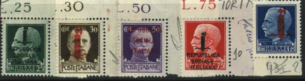
Rome overprints
The
Roman issue of the Fascetti certainly is the most common and
these stamps had been distributed to all regions of the Republican
territory, excluded therefore Campania, Puglia,Basilicata, Calabria,
Sicily, and Sardinia already conquered by Allies. On June 4
1944, Allies occupied Rome, and The State Polygraphic, obviously,
stopped every stamps overprint. |
 |
Printing impression
The
Roman issue of Fascetti have, usually, a strong overprint impression
visible on the back, especially for red ink overprints( 30c.
- 50c. - 1,25L. ).For stamps with big fasces ( 30c. - 1,25L.
), this impression causes an ink spreading along the right edge
of the fasces, it is the ink ejected by press punch. |
Inking
On
stamps with black overprint, the ink is usually light black
or dark grey and clotted. On stamps with red overprint, the
ink is normally brick red. In spite of strong impression, red
and black overprints have bad quality and the inking is not
uniform. We can see many little holes inside red overprints
and many ink spots around characters for black overprinted stamps. |
Impression features
The
most important feature is, for black overprinted stamps, the
final A of REPUBBLICA and ITALIANA. Often, the right stem of
this letter is short. Moreover, the first I of ITALIANA is often
short on the top. All stamps issued in Rome have overprints
smudged and buckled. |
Verona overprints
Also
this issue, like Rome, is very common. Verona's Fascetti were
overprinted by Chiamenti's Typographic Industries. They were
distributed in all Northern Italy. |
 |
Printing impression
The
overprint impression of this issue is usually light and it is
not visible on the back, moreover it is uniformly applied on
sheet. The letters and characters are clearly impressed without
holes inside overprint. |
Inking
This
is a good quality inking. Red inks have variable colours, from
transparent red to dark brown red. The ink density is variable
too, from little to very hidding.Sometimes a little percentage
of white lead was added to improve hidding quality of overprint
( this is the most important feature of Florence issue). Also
black inks appear not very hidding but homogeneouses. |
Impression features
Impression
is usually clear and slimeless, letters and characters are well
done and without deformations although the top of fasces in
black ink overprints, appears not well definited and without
details. Altogether I think this issue is the better in quality.
|
Florence overprints
The
stamps of Florence's issue are uncommons and they are only stamps
that can be always identified, even though isolated. Florence's
Fascetti were overprinted by Valgiusti's Typographic Industries.The
issue of Florence was the worst of all overprints studied. Letters
and draws are rounded, shortened and smudged. This issue was
distributed in Tuscania and east Liguria.
|
 |
Printing impression
Printing
impression is extremely irregular. Usually the lower part of
the overprint is more impressed than upper part ( for black
ink overprints only ), while red ink overprints have the ribbons
of fasces and the cutting edge of axe more impressed than stem.
|
Inking
Black
inks are plentiful, clotted and mixed, while reds have good
quality and they are variable from deep red to lilac and carmine.To
improve hidden quality of overprint sometimes was added a lot
of white lead( Biacca),only for red ink overprints, stamps with
this colour ink can be always identified. White lead reduce
the transparency of red inks, so the overprint is more visible.
|
Impression features
This
is a very poor quality print.In black ink overprints there are
many ink stains and spots around draws and letters, and some
letters are buckled and shorted.The top of fasces is often buckled
and pike is often without points. Red ink overprints have often
fasces ribbons shorted. |
Milan overprints
This
issue is uncommon and these stamps are not always distinguishable
from other issues but, some stamps have ink and print feature
that can be easily recognizable. These stamps were distributed
in Lombardy, Northern Liguria and east Piedmont. Values of 30c.
and 1,25 Lire ( big red fasces ) were not overprinted at Milan.
|
 |
Printing impression
Printing
impression of these stamps was not strong and not visible on
back. |
Inking
Black
inks are oily and greasy while red inks are variable from red
to red vermilion. The value of 50c. with red vermilion ink is
easily recognizable. |
Impression features
Stamps
with black ink overprint have bad quality and the ink generates
a veil that coming out from the letters, moreover in the values
of 25c. and 75c., the final part of the right ribbon of fasces
end like a shaped hook. The top of fasces is often confused
and splashed,while the top of axe and the top of upper pike
often are folded between themselves ( cat's ears ). A lot of
the value of 50c. was overprinted with vermilion red, the letters
of the last row of this overprint ( ITALIANA ) are often welded
between themselves. |
Genoa overprints
This
rare issue was made with extreme accuracy, the zinc cliches
were the better between all other issues. Stamps were overprinted
by Marini's Typographic Industries and distributed in Liguria
only. |
 |
Printing impression
Printing
impression of this issue is very variable but never strong.
In some stamps it is visible on back. |
Inking
Red
and black inks usually have not good qaulity, blacks are generally
very strong but not uniformly distributed, it can originate
little cracks, reds are strong too and, in some cases, they
tend to lilac. |
Impression features
Usually
It is very difficolt to define if values of 30c. and 1,25 Lire
can belong at this issue, in some stamps the print is well done,
others have, instead, a very bad print, similar at Rome overprints.
Stamps overprinted by black inks ( 25c. and 75c. ) have clearly
print but, head of fasces usually is not well done. In some
sheets U and I of REPUBBLICA are lightly shorted. |
Turin overprints
Maybe overprinted
by Dragonero's Typographic Industries, these stamps were distributed
in all Piedmont and in part of Liguria. This issue is uncommon. |
 |
Printing impression
Between
all issues studied, these stamps have the lowest printing impression,
never visible on back. |
Inking
This
issues usually has good quality inks, red inks are fluids and
variables from watered red to orange red, in some cases there
are many little dots ( ink drips) around the stem of fasces.
Black inks are usually clotted and not uniform. |
Impression features
Black
ink overprint stamps, usually have the letters U,L and I are
shorted on top, while letter A is shorted in its lower part,
like a capital delta. The values of 30c. and 1,25 Lire have,
as above wrote, many little dots around the stem of fasces.
The value of 50c. usually has a strong inking and the ink spreads
around the letters. |
![]()